Finding the perfect brand colour palette
Colour plays an important role in your brand identity. Colour is used to evoke an emotion or response, which helps to tell your brand story without using words.
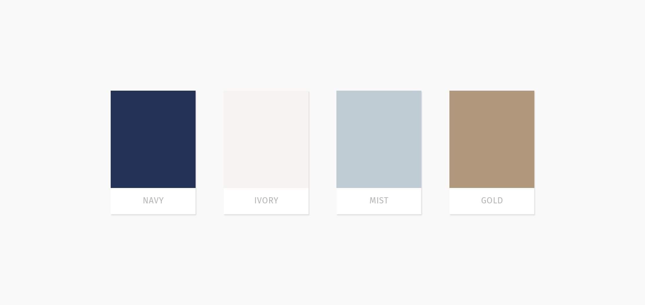
I choose my primary colour depending on the brand's personality. I choose the most important personality trait and pick a colour to match. I then choose an accent colour that is complementary to the primary colour. The third and fourth colours are base colours and are either neutral or a paler shade of the primary colour.
Red
Red stands for passion, excitement and anger. Red has a tendency to appear nearer than it is, which is why it’s often used to grab our attention. It’s commonly used for sales and warnings.
Orange
Orange stands for playfulness, vitality and friendliness. It is invigorating and evokes energy.
Yellow
Yellow evokes happiness, youth and optimism, commonly used for attention-grabbing or affordable.
Green
Green evokes stability, prosperity, growth and a connection to nature. It’s the colour of balance. Plenty of green indicates growth, nourishment and a natural balance to the world around us.
Light Blue
A light shade of blue exudes tranquillity, trust, and openness. It can also signify innocence.
Dark Blue
Dark blue stands for professionalism, security and formality. It is mature and trustworthy.
Purple
Purple can signify royalty, creativity and luxury.
Pink
Pink stands for femininity, youth and innocence. It ranges from modern to luxurious.
Brown
Brown creates a rugged, earthy, old-fashioned look or mood.
White
White evokes cleanliness, virtue, health or simplicity. It can range from affordable to high-end.
Gray
Gray stands for neutrality. It can look subdued, classic, serious, mysterious or mature.
Black
Black evokes a powerful, sophisticated, edgy, luxurious and modern feeling.
Little Gem Design was established in 2013, a graphic design studio based in Lower Hutt, Wellington. Specialising in helping small businesses craft unique standout brands.